In the fast-paced world of product launches, the importance of a well-crafted pre-launch strategy cannot be overemphasized. Effective preparation sets the tone for customer reception and significantly influences the success of your endeavor. For startups, entrepreneurs, and digital marketers, a compelling pre-launch landing page is a vital tool to build anticipation, collect leads, and generate valuable customer insights before the big day.
The Important Role of Pre-launch Validation
Before you pour resources into a definitive launch, product validation acts as a safeguard. A pre-launch landing page is your direct conduit to potential customers’ appetites. By assessing early interest and need, you can tweak your offering to better fulfill the market’s desires, ensuring your launch is a sprint, not a block. And luckily, there are several tools available at Prelaunch to help you do just that.
The pre-launch page is more than a teaser. It’s a powerful tool to generate buzz and build a community around your upcoming product. It’s a space for potential customers to learn, engage, and commit early.
In this guide, we’ll detail what a pre-launch landing page involves, how to structure it for maximum impact, provide tips to make it a conversion powerhouse, and showcase examples that epitomize success.
Short Checklist
If you’re in a hurry, check out the list below for all the main sections you should include for an effective prelaunch landing page.
✅Above the Fold (First Messaging): Should contain a clear headline, a succinct subheadline, a hero image or video, and a call-to-action (CTA) that cuts to the chase.
✔️Headline: Clear, concise, and oriented towards benefits to capture immediate attention.
✔️Subheadline: This should complement your headline by providing more context.
✔️Hero Image/Video: Showcase your product in action.
✔️Clear Value Proposition: Explain what your product does and what value it brings to your customer’s life
✔️Call to Action (CTA): Your CTA should be prominent and action-oriented.
✅Below the Fold: After hooking visitors, educate them further. Elaborate on the benefits, showcase features, explain how your product works, and provide any necessary specifications.
✔️Benefits Section: Provide more detail on how your product addresses key pain points
✔️Features Section: Offer concise bullet points that detail the specific features your product provides.
✔️How It Works Section: A straightforward explanation using simple terms and, if necessary, visuals, should illustrate the practicality of using your offering.
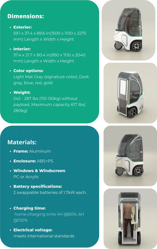
✔️Specifications Section (Optional): For more complex products, list technical specifications that will matter to your audience.
✅Middle of the Page: Keep the momentum going by reiterating your CTA in this section.
✅Further Down the Page: Consider including sections like assorted color and variation options, an FAQ, and a team introduction.
Structuring Your Pre-Launch Landing Page
The structure of your landing page is crucial. It’s the difference between a visitor giving their email eagerly or closing the tab dismissively. A solid framework assures your potential customer that you are serious, professional, and worth their time.
Above the Fold (First Messaging):
When a visitor lands on your page, this area should be instantly compelling. It should contain a clear headline, a succinct subheadline, a hero image or video, and a call-to-action (CTA) that cuts to the chase.
Headline: Your headline should be the first thing visitors see. It should be clear, concise, and oriented towards benefits to capture immediate attention.
Examples:
- “Unlock the Future of Home Entertainment” – This headline suggests innovation and advancements that the visitor can be a part of.
- “Make Your Workday more Productive with Seamless Connectivity” – Here, the focus is on the practical benefits to the visitor’s daily life, making it instantly appealing.
- “Transform Your Relaxation Experience with Our New Portable Hammock” – This headline directly communicates the value proposition, appealing to the customer’s desire for comfort and convenience.
Subheadline: Your subheadline should complement your headline by providing more context. It’s a chance to further explain what you offer in a compelling manner.
Examples:
- “Experience next-gen entertainment before anyone else. Join our community to get early access.”
- “Say goodbye to disrupted work calls and slow downloads. Sign up now for priority access.”
- “Experience the ultimate relaxation with our new portable hammock. Book your spot now for exclusive early bird deals.”
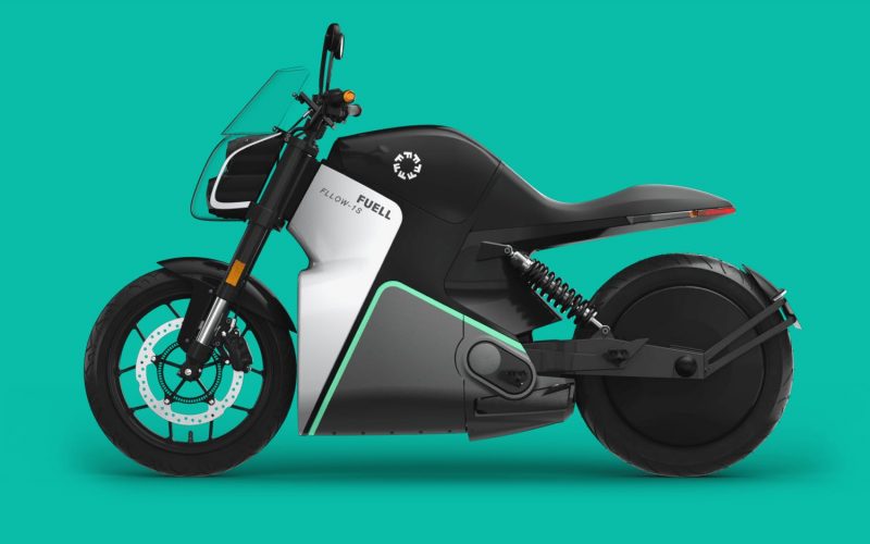
Hero Image/Video: Visuals speak volumes. A high-quality hero image or video should resonate with your target audience and support your offering’s narrative. It should showcase your product in action, evoke emotion, and provide a glimpse of the experience you’re offering.
Examples:
- A video of people enjoying a new gaming console with exceptional graphics and sound quality.
- An image of someone working efficiently on their laptop with a reliable internet connection.
- A photo of a person relaxing in a new portable hammock, enjoying the comfort and ease of setting it up outdoors.
Clear Value Proposition: In a few sentences, explain what your product does and what value it brings to your customer’s life. How does it solve a problem or improve an experience?
Examples:
- “Step into the next era of home entertainment with our platform, offering unparalleled immersion, exclusive content, and a community of enthusiasts ready to welcome you.”
- “Revolutionize your office setup with our connectivity solutions. Bid farewell to interruptions and inefficiencies, and say hello to seamless, productive workdays.”
- “Elevate your outdoor experiences with our new portable hammock, designed for adventurers who seek the best in comfort and convenience. Enjoy nature, relax anywhere, and turn every outdoor moment into a blissful escape.”
Call to Action (CTA): Your CTA should be prominent and action-oriented. Consider using text that propels visitors towards the next step, such as “Reserve Your Spot” or “Get Exclusive Access.”
Below the Fold:
After hooking visitors above the fold, you must then educate them further. Use this space to elaborate on the benefits, showcase features, explain how your product works, and provide any necessary specifications. This section keeps potential customers engaged.
Benefits Section: Expand with a bit more detail on how your product addresses key pain points and improves the customer’s life.
Let’s expand on one of the examples we mentioned above: a pre-launch landing page for a new portable hammock:
Headline: Escape Anywhere with the All-New Nomad Hammock
Benefits:
- Relaxation on the Go: Ditch the bulky beach chairs and unwind anywhere with our lightweight, portable hammock.
- Effortless Setup: Unwind in seconds! Our hammock sets up in minutes with no tools required, perfect for spontaneous adventures.
- Durable Comfort: Crafted from high-quality, breathable materials, our hammock offers superior comfort and supports up to 300 lbs.
- Compact & Carry-Friendly: Folds up into a neat, compact carrying case, making it easy to take anywhere – the park, the beach, or even your backyard!
- Weatherproof Design: Made with water-resistant fabric, this hammock is built to withstand the elements, so you can relax rain or shine.
This benefit section uses clear and concise language to highlight the key advantages of the product. It focuses on how the hammock solves user problems (finding relaxation, easy setup) and emphasizes the benefits it delivers (comfort, portability, durability).
Features Section: Offer concise bullet points that detail the specific features your product provides. Features give substance to the benefits you’ve highlighted earlier.
Here are some features worth mentioning about a portable hammock on a landing page, building upon the benefits already highlighted:
- Features that enhance relaxation and comfort:
- Double-sided quilted design: Provides extra padding and pressure relief for ultimate comfort.
- Breathable, quick-drying fabric: Stays cool and comfortable even on hot days.
- Ergonomic headrest (optional): Offers additional neck and head support for ultimate relaxation.
- Integrated mosquito net (optional): Provides protection from pesky bugs, allowing you to relax worry-free.
- Features that highlight portability and ease of use:
- Ultra-lightweight and compact design: Folds down to a small size that easily fits in a backpack or travel bag.
- Durable, high-strength suspension straps: Made from strong, weather-resistant materials for secure hanging.
- Carabiner clips with safety locks: Ensure quick and secure attachment to trees or hammock stands.
- Built-in storage pouch (optional): Provides a convenient spot to store your phone, keys, or other small items.
By strategically incorporating these features, you can provide visitors with a clear understanding of how the hammock functions and the specific benefits it offers.
How It Works Section: A straightforward explanation using simple terms and, if necessary, visuals should illustrate the practicality of using your offering.
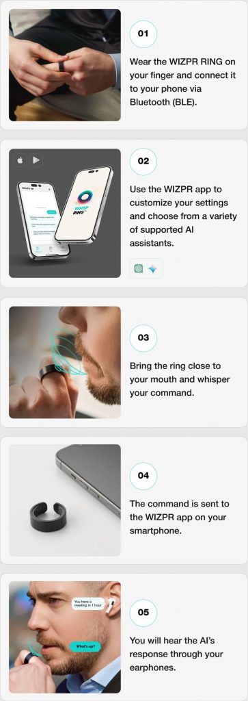
Example:
Unwinding with the Nomad Hammock is as easy as 1-2-3:
- Find Your Spot: Locate two sturdy trees or posts spaced 10-15 feet apart.
- Secure the Straps: Wrap the included suspension straps around each tree trunk or post, ensuring a snug fit. Carabiner clips with safety locks make attachment quick and secure.
- Hang & Relax: Attach the hammock’s end loops to the carabiner clips. Adjust the strap length for a comfortable 30-degree angle and settle in for ultimate relaxation!
**This hammock can also be used with a compatible hammock stand (sold separately) for freestanding setup in parks or backyards without trees.
- Specifications Section (Optional): For more complex products, list technical specifications that will matter to your audience. This lends an air of transparency and authority.
Middle of the Page:
Keep the momentum going by reiterating your CTA in this section. Sometimes, potential leads need more convincing, and this part ensures they don’t miss a second invitation to join your pre-launch community.
CTA 1 (Benefit Focused):
- Button Text: Pre-Order Your Relaxation Now! (Up to 20% Off)
This CTA emphasizes the key benefit (relaxation) and creates urgency with a pre-order option and a discount incentive.
CTA 2 (Scarcity Focused):
- Button Text: Reserve Your Limited-Edition Nomad Hammock (Only 50 Left!)
This CTA highlights exclusivity by mentioning a limited edition and creates a sense of scarcity to encourage immediate action.
Further Down the Page:
In the latter part of your page, consider including sections like assorted color and variation options, an FAQ, and a team introduction. These serve practical and relational functions by addressing customer considerations and establishing trust and credibility.
Below we continue the hammock example for these respective sections:
Colors and Variations:
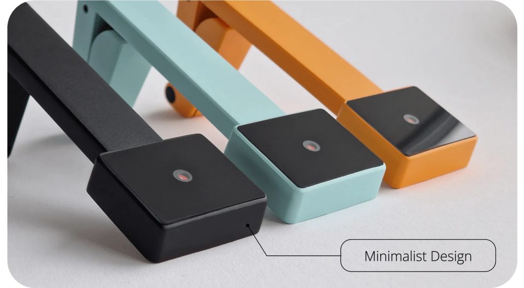
Unwind in style! The Nomad Hammock comes in a variety of vibrant colors to suit your personality:
- Classic Navy: A timeless choice for a touch of sophistication.
- Sunset Orange: Embrace the adventurous spirit with this warm, energetic hue.
- Tropical Teal: Relax and unwind with calming island vibes.
- Woodland Green: Blend seamlessly with nature for a truly immersive experience.
FAQ Section:
Q: How much weight can the Nomad Hammock hold?
A: The Nomad Hammock can comfortably support up to 300 lbs.
Q: How easy is it to set up the hammock?
A: The hammock sets up in minutes! Simply wrap the included straps around two trees or posts and secure them with the carabiner clips. No tools required!
Q: Can I use the hammock with a stand?
A: Yes, the Nomad Hammock is compatible with most portable hammock stands (sold separately). This allows for freestanding setup in parks or backyards without trees.
Q: What’s included with the purchase?
A: Each Nomad Hammock purchase includes the hammock itself, two durable suspension straps with carabiner clips, and a compact carrying case.
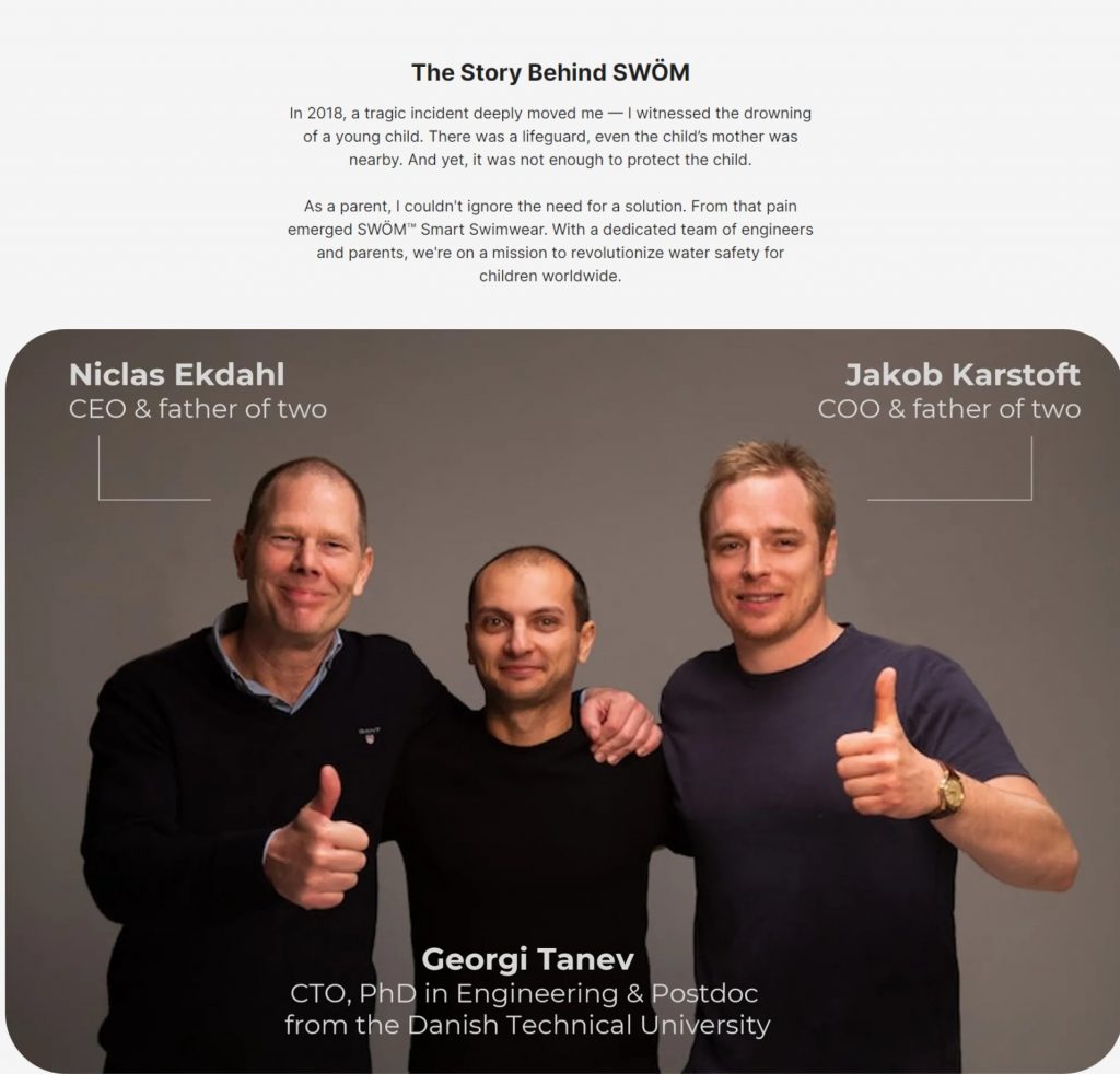
Team Introduction:
Meet the Nomads Behind the Relaxation Revolution!
We are a passionate group of outdoor enthusiasts dedicated to creating innovative gear that enhances your connection with nature. We believe everyone deserves a chance to unwind and recharge, and the Nomad Hammock is our way of making relaxation accessible and convenient.
(Optional – Add Team Member Photos and Short Bios):
- Sarah Jones – Lead Designer: Sarah brings her expertise in comfort and ergonomics to create hammocks that are as supportive as they are stylish.
- David Miller – Product Engineer: David ensures the Nomad Hammock is built with the highest quality materials and construction techniques.
- Emily Chen – Marketing Director: Emily is passionate about sharing the Nomad Hammock experience and helping people discover the joy of relaxation outdoors.
By incorporating these sections, you provide visitors with additional information about color options, address common concerns, and build trust by introducing the team behind the product.
Additional Considerations:
There are several other key design and content strategies to include. Social proof, a minimalist navigation setup, and a mobile-friendly design are just a few. These elements keep the experience focused, credible, and accessible, ultimately driving conversions and building a solid foundation for your product’s launch.
5 Tips for Crafting a Pre-launch Landing Page to Maximize Lead Generation
Crafting a captivating landing page is an art form. Here are some key tips for crafting an effective pre-launch landing page that generates buzz and captures leads:
Hook ‘Em Early:
- Captivating Headline: Craft a headline that’s clear, concise, and sparks interest. Highlight a key benefit or use a question to pique curiosity.
- Visually Appealing: Use high-quality images or videos that visually represent your product and its benefits.
Intrigue and Inform:
- Problem & Solution: Don’t just showcase the product; explain the problem it solves and how it makes life better.
- Limited Information (Strategic): Provide enough details to pique interest without revealing everything. This fosters a sense of exclusivity and keeps them coming back.
- Focus on Benefits: Move beyond features and emphasize the benefits your product delivers. How will it improve users’ lives?
Capture Leads and Build Hype:
- Compelling CTAs: Use strong calls to action that tell visitors exactly what to do next (e.g., “Get Early Access,” “Join the Waitlist”).
- Incentivize Sign-Ups: Offer an incentive for signing up, like exclusive discounts, early access notifications, or bonus content.
- Social Proof (Optional): If you have testimonials, partnerships, or media mentions, leverage them to build trust and credibility.
Keep it Clean and Clear:
- Simple Design: Prioritize a clean, uncluttered design that’s easy to navigate. Focus on the core message and avoid overwhelming visitors.
- Mobile-Friendly: Ensure your landing page looks great and functions flawlessly on all devices, especially mobile phones.
Plan for the Future:
- Capture Emails: The primary goal is often to collect email addresses for further communication.
- Social Media Integration: Integrate social media sharing buttons to expand your reach and generate buzz.
- Post-Signup Strategy: Have a plan for nurturing leads who sign up. Consider drip email campaigns or exclusive content to keep them engaged.
By following these tips, you can create a pre-launch landing page that effectively builds anticipation, captures valuable leads, and sets the stage for a successful product launch.
3 Pre-launch Landing Page Examples that Set the Standard
The best way to understand the power of a pre-launch landing page is to see it in action. Here are a few standout examples that have leveraged the pre-launch landing page concept to perfection.
Agwa: Your Effortless, AI-Assisted Home Garden
This landing page’s purpose is product validation. In other words, the creators behind the product are trying to assess the market need. The landing page’s aesthetics complement the innovative minimalist style of the product it features.
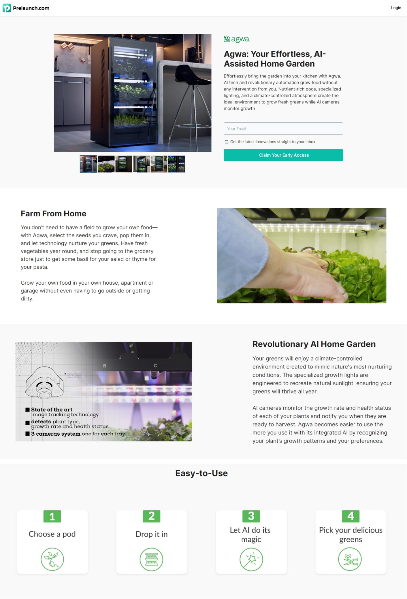
But that’s not all. There’s a lot more going on. Scroll down to learn what you can take away from this example.
For your next landing page:
- Include an email sign up to subscribe every 3-4 scrolls (having it only at the beginning or the end often leads people to forget)
- Tailor your messaging based on the intent of the landing page – In this Prelaunch example, the goal is to test market interest.
- Devote your first 3-4 scrolls to addressing the needs of your target audience and presenting your product’s USPs.
“Recess” Craft Mocktails in a Can
This vibrant landing page for Recess utilizes an eye-catching color scheme and animation to bring its craft mocktail product to life. High-quality images and a clear path to product selection make it both engaging and efficient.
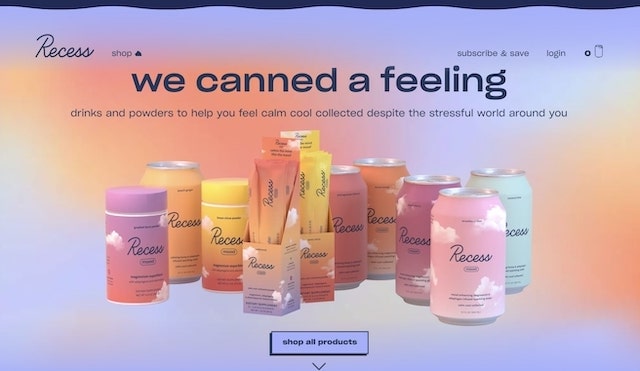
For your next landing page:
- Apply captivating colors and designs;
- Incorporate animation and 3D features to create an engaging, scroll-halting effect;
- Wherever you can, insert attractive images of your products.
Apple’s MacBook Air
The landing page for Apple’s MacBook Air is as sleek and minimalist as the product it represents. Well-placed product selection tables and snippets that address customer concerns create an informative yet elegant experience.
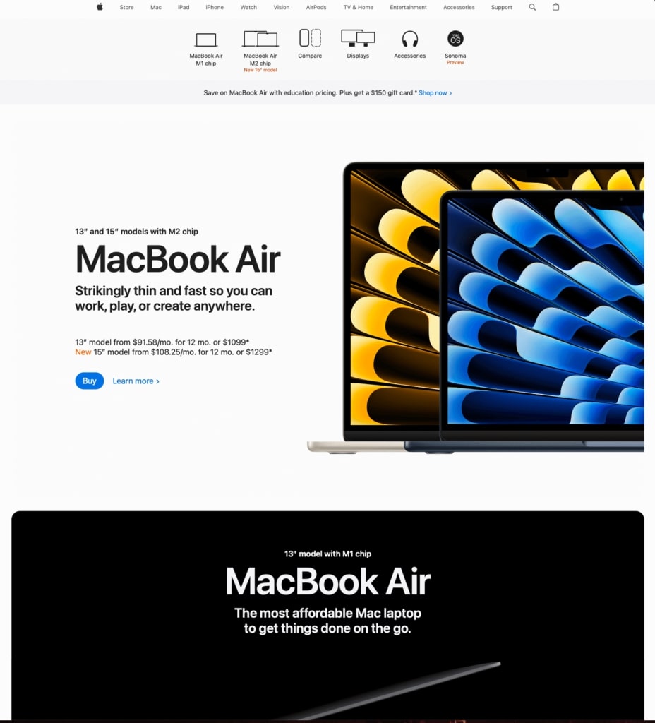
For your next landing page:
- Maintain a simple yet insightful approach;
- Handle doubts and refutations by employing dynamic components;
- Position your merchandise as the main attraction on your landing page.
How to Optimize Your Product Based on Customer Insights Before Launch
Perhaps the most exciting part of the pre-launch phase is the opportunity it gives you to course-correct based on customer feedback. Prelaunch offers an exemplary model for doing this efficiently.
The platform focuses on optimizing your product based on customer insights before launch through a few key features:
Reservation System:
- Prelaunch uses a reservation system where potential customers can reserve a product with a small deposit. This deposit is credited towards the purchase price at launch and serves as a strong indicator of buying intent. By gauging the number of reservations, you get a clearer picture of potential market demand for your product.
Analytics and Data Tracking:
- Prelaunch doesn’t just collect reservations; it also tracks a wide range of visitor data. This includes metrics like click-through rates on CTAs, time spent on specific sections of the landing page, and sources of traffic. By analyzing this data, you can identify areas of interest, user behavior patterns, and potential pain points.
Comparison with Industry Averages:
- Prelaunch compares your product’s conversion rates and other key metrics with industry averages. This allows you to see how your product stacks up against similar offerings and identify areas for improvement.
Benefits of Using Prelaunch.com:
- Reduced Risk: By validating market demand and identifying potential issues before launch, you can reduce the risk of investing heavily in a product that might not resonate with your target audience.
- Data-Driven Decisions: The data collected through Prelaunch allows you to make data-driven decisions about product features, pricing strategy, and marketing campaigns.
- Iterative Improvement: Based on the insights gained, you can refine your product, messaging, and pricing before launch, potentially leading to a more successful product rollout.
Conclusion
Your pre-launch landing page is a sneak peek that can make or break your product’s initial reception. We’ve covered the essentials of crafting an effective pre-launch page, shared tips on maximizing lead generation, and highlighted examples that embody success. Pair this guide with your product innovation, and you’re ready to set the stage for a triumphant launch.